By The Tom Buerger Team
If you work from home in Washington, D.C., and also want a comfortable place for out-of-town visitors to stay, you already know the challenge: floor plans here rarely include a spare room for every function you need. Rowhomes in Capitol Hill, condos near Dupont Circle, and townhomes in Georgetown often ask a single room to pull double duty. The good news is that a well-designed, dual-purpose room can serve you beautifully on a busy Tuesday of back-to-back calls and again on a weekend when your in-laws come to town.
The key is planning the space so that neither function feels like an afterthought. A room that reads as a cramped office with a couch shoved in the corner will not impress overnight guests, and a room designed only for visitors will leave you stressed every workday. When you thoughtfully layer furniture, storage, and lighting, you get a home office that doubles as a guest room without either purpose feeling compromised.
This guide will walk you through the decisions that matter most, from choosing the right convertible furniture to arranging the layout so that your workspace transitions smoothly into a welcoming retreat. Whether you are outfitting a spare bedroom or carving space out of a den, these strategies will help you make the most of every square foot.
Key Takeaways
- A dual-purpose room works best when you plan both functions from the start rather than adding one later.
- Convertible furniture, such as a quality sleeper sofa or a wall bed, is the foundation of a room that serves work and rest equally well.
- Smart storage keeps work materials out of sight when guests arrive, so the room feels restful rather than cluttered.
- Layered lighting lets the same space shift from a productive daytime office to a calm overnight retreat.
- Thoughtful design choices protect your home's resale value, especially in a competitive real estate market like Washington, D.C.
Start With a Layout That Serves Both Functions
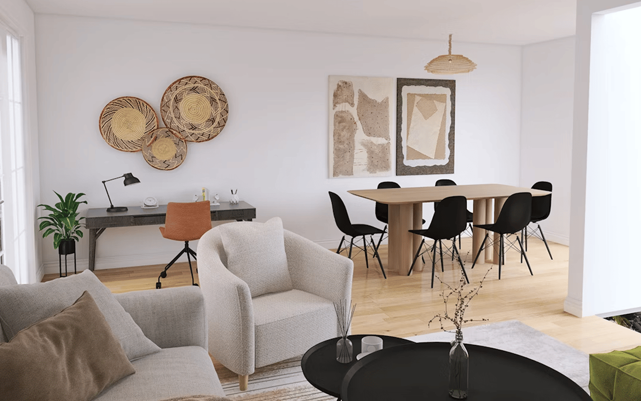
Before you buy a single piece of furniture, map out how the room will flow. Stand in the doorway and picture your workday: where does the natural light fall, where will your desk face, and where can a guest bed live without blocking the closet or the window? The best dual-purpose rooms have clearly defined zones, so your eye reads a work area and a rest area even though they share four walls.
qIn most D.C. homes, the desk should anchor the wall with the best light and the fewest distractions, while the sleeping surface can occupy the opposite side or fold away entirely when not in use. If your room is on the smaller side, which is common in city rowhomes, a floating desk or a slim console can free up valuable floor area. Measure carefully and account for the swing of the door, the clearance around a pull-out bed, and the path that a guest will walk in the dark.
Traffic flow matters more than people expect. A guest should be able to reach the bed, set down a suitcase, and get to the bathroom without navigating around your office chair or a tangle of cords. Planning these paths in advance prevents the awkward shuffling that makes a shared room feel improvised.
What To Prioritize In Your Layout
- Position the desk near a window for natural light during the workday.
- Leave at least two feet of clearance around any pull-out or fold-down bed.
- Keep the path from the door to the sleeping area clear of cords and furniture.
- Reserve one wall or corner for storage, so work materials have a dedicated home.
Choose Convertible Furniture That Earns Its Place
The single most important investment in a dual-purpose room is the piece that transforms. A high-quality sleeper sofa gives you comfortable daytime seating and a real bed at night, while a wall bed, sometimes called a Murphy bed, folds flat against the wall to reclaim your entire floor during work hours. Some wall beds even integrate a desk that stays level when the bed folds up, which is ideal for tight quarters.
When you shop, sit on the sofa and, if possible, lie on the mattress. A thin, uncomfortable pull-out will leave guests restless and reflect poorly on your hospitality. Look for a supportive mattress, a sturdy frame, and upholstery that suits daily use. The goal is a piece that looks intentional in your office and feels restful for anyone who stays over.
Your desk deserves the same scrutiny. A desk with a closed front or built-in storage hides paperwork and equipment quickly, so the room can shift from work mode to guest mode in minutes. If you take frequent video calls, consider how the background will look, and choose a desk placement that keeps clutter out of the frame.
Furniture Worth Considering
- A sleeper sofa with a supportive mattress serves as seating by day and a bed by night.
- A wall bed folds away to reclaim floor space during working hours.
- A desk with drawers or a closed front conceals work materials when guests arrive.
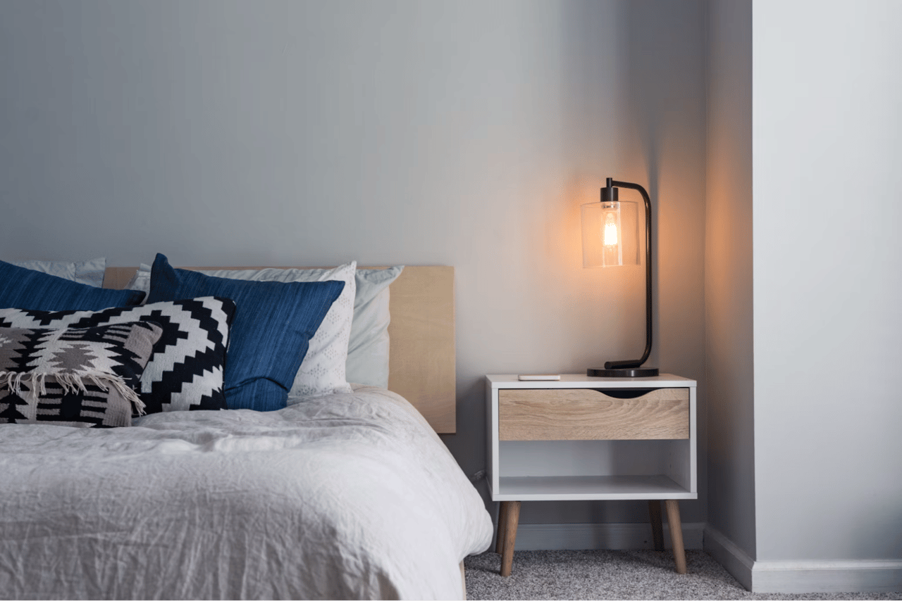
- A slim nightstand or side table gives guests a surface for a phone, a book, or a glass of water.
Build In Storage That Hides the Work
Nothing undermines a guest room faster than visible clutter. When your monitor, cables, files, and office supplies are on full display, the room reads as a workspace with a bed in it rather than a comfortable retreat. Strategic storage solves this by giving every work item a place to disappear when your visitors arrive.
Vertical storage is your friend in D.C. homes, where floor space is often limited but ceilings can be generous. Tall bookcases, wall-mounted shelves, and cabinets with doors let you store upward instead of outward. A closed cabinet or an armoire can hold your printer, supplies, and paperwork behind doors, so a five-minute tidy transforms the room. Baskets and bins on open shelves offer a quick way to sweep loose items out of sight.
Do not overlook the closet if the room has one. A well-organized closet can house your office overflow while still leaving room for a guest to hang a few things. Reserving even a small section of empty hanging space signals genuine hospitality and keeps your visitors from living out of a suitcase on the floor.
Storage Solutions That Keep the Room Flexible
- Closed cabinets and armoires hide printers, supplies, and paperwork behind doors.
- Vertical shelving takes advantage of wall height without eating into floor space.
- Labeled baskets or bins let you clear loose items quickly before guests arrive.
- Reserved closet space, including a few empty hangers, welcomes overnight visitors.
Layer Lighting and Comfort for Both Purposes
A room that works as both an office and a guest space needs lighting that can shift between two very different moods. During the workday, you want bright, focused light that supports concentration and looks clean on video calls. At night, a guest wants warm, soft light that helps the room feel restful. Relying on a single overhead fixture will serve neither purpose well.
The solution is layered lighting. Combine a task lamp at the desk for daytime focus with a bedside lamp or a soft floor lamp for evening warmth. Dimmable bulbs and smart plugs let you adjust the ambiance without rewiring anything, and they give guests easy control over their own comfort. Position at least one light within reach of the bed, so a visitor is never left fumbling in the dark.
Comfort extends beyond lighting. Keep a spare set of quality linens, a couple of pillows, and a folded throw blanket ready in a nearby closet or storage bench. Small touches, such as blackout curtains for morning sleepers and a small clock or charging station by the bed, turn a functional room into one that guests actually enjoy. These details cost little but make a lasting impression.
How To Make the Space Comfortable for Guests
- Use a task lamp for focused daytime work and a softer lamp for evening warmth.
- Install dimmable bulbs, so the same room can feel energizing or relaxing on demand.
- Keep quality linens, extra pillows, and a throw blanket stored nearby and ready.
- Add blackout curtains and a bedside charging station for overnight comfort.
FAQs
What Is the Best Furniture for a Home Office That Doubles as a Guest Room?
The best foundation is a convertible piece that transforms the room's function. A quality sleeper sofa or a wall bed lets the space work as an office by day and a bedroom by night. Pair it with a desk that has closed storage, so work materials can disappear when guests arrive. Prioritize comfort in the mattress, because a restful night for your guests matters just as much as a productive day for you.
How Much Space Do I Need for a Dual-Purpose Room?
You can create a functional dual-purpose room in a surprisingly small footprint, which is helpful in many Washington, D.C., homes. A wall bed is especially useful in tight quarters because it reclaims the entire floor when folded up. As a general rule, leave about two feet of clearance around any pull-out or fold-down bed, so guests can move comfortably.
Will a Home Office and Guest Room Combination Affect My Home's Value?
A well-designed flexible room can be an asset when you sell, since many buyers in the D.C. area value versatile space. Buyers increasingly look for rooms that can adapt to remote work, visiting relatives, or changing needs over time. The key is making sure the room reads as intentional and polished rather than crowded.
Make Your Space Work as Hard as You Do
A home office that doubles as a guest room is one of the smartest ways to get more out of your Washington, D.C., property. With the right convertible furniture, thoughtful storage, and layered lighting, a single room can support your most productive workdays and welcome your favorite people just as gracefully.
If you are thinking about how a flexible room fits into your larger goals, whether you are settling into a new home or preparing to sell one, we would love to help. Our team knows the D.C. real estate market inside and out, and we understand how buyers respond to versatile, well-designed spaces. We can guide you through choices that serve your daily life now and support your home's value down the road.
Ready to make the most of every room in your home? Reach out to
The Tom Buerger Team today, and let us help you turn your space into something that truly works for you.